Fight Night: Websites VS Lookbooks
When it comes to marketing and sales, you’ve got a lot of tools in your toolbox. However, when it comes to all things digital, many suppliers are happy to hobble themselves and only use a website. That’s like forcing yourself to exclusively use a hammer when the world is full of more than just nails.
Obviously, your website is an essential part of your business. You don’t exist in the modern professional world if you don’t have a website. It has everything from your contact information to your policies, history, and of course, every product you have for sale.
Theoretically, your website allows customers to search your entire product lineup, from your latest releases to your tried and true classics and everything between. There’s a common problem with websites, though: they can be a firehose, and when you’re trying to nurture a burgeoning relationship with a new client, you don’t want to overwhelm them with information.
If you’ve got a client looking to serve a specific vertical market, how do you engage with them? That sort of hyper-specific product curation has long been a problem for suppliers. Either you devote a ton of time and resources to create a brand new piece of digital content, or (as is more likely the case) you send a clunky PowerPoint deck.
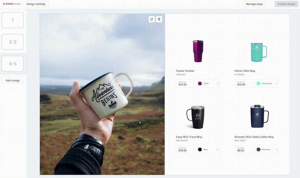
That’s where a digital lookbook comes in handy. These mini catalogs can show off a small collection of products in a visually impressive format that will catch your client’s attention and allow you to tell an actual story with your design instead of just tossing a bunch of links at their face and leaving them to paint their own picture.
Creating an attractive look book used to take days (if not weeks) to put together, but with tools like ZOOMstudio and Smart Layouts, days have become minutes. Literally. We put this entire catalog together in less time than it took to write this blog entry: check it out.
Now you can narrow your focus and show your clients only the most relevant products for their projects; plus with Smart Layouts, you can easily guide them through a product story by picking the page designs that will help you lead them to the best products.

Just pick your layout and choose the products you want to fill the available slots. We recommend creating a hierarchy by using double-page spreads to set the mood. Then, focus on categories like good, better, and best choices.
Add lifestyle images and stock photography from Unsplash to elevate the look of your new creation to a professional level, and then share them and track the usage analytics from your ZOOMstudio dashboard.
How to Make a Lookbook or Catalog with ZOOMstudio Smart Layouts
ZOOMstudio and Smart Layouts expand your digital toolbox with a variety of options, allowing you to approach your marketing and sales opportunities with a new level of nuance and versatility. For more details on ZOOMstudio, reach out and contact us.
Effective Email Marketing: What You Need to Know
When it comes to selling your products in an increasingly online world, one of the best things to do as a supplier is create an email…
How to market your ZOOMcatalogs
Marketing your ZOOMcatalogs and ZOOMcustom catalogs and flyers is important! Make sure distributors know about these awesome new tools you…


