Thumb Stoppers
You’ve got ten minutes until the end of your lunch break and your phone in your hand. You decide to open up Instagram. Why? Make a quick list of the reasons. Chances are it looks something like this: to check in on your friends and family’s stories, to share that cute picture of your dog you snapped this morning, or to laugh at the latest Tik Tok dance making the meme rounds this week.
Rarely, very rarely, do we open up our social media apps because we want to look at a bunch of advertisements. In fact, “too many ads” is one of the main reasons people leave social media.
So why, when you’re creating posts for your company’s account, would you want to make it look like an advertisement?
Short answer: you wouldn’t. Even if the text in the post is as Holiday-Used-Car-Salesy as possible (even though it shouldn’t be; read more on that in “Zen and the Art of Selling Without Selling”), you at least want your image to be engaging. You want the visual aspect of your post to catch attention. You want it, to be a thumb stopper.
“What’s a thumb stopper?” You might ask.
No, it’s not that new teen rom-com on Netflix.
A thumb stopper is an image so impressive, so engaging or aspirational, so dang pretty that it makes us put our thumb down on our phone screen and stop the endless doom scroll.
Why do we want this? Because the longer someone spends looking at our post, the more likely they are to engage with it, and the more likely they are to engage with it, the more likely we are to ultimately make a sale.
(For more tips on selling on social media, check out our Trends blog guides.)
Many suppliers spend a lot of time and resources putting together lifestyle photoshoots for their products, giving distributors plenty of material to work with. For some of our recent favorites, check out the intro to S&S’s 2022 Summer Style Guide, PCNA’s ProudPath Catalog, or Raining Rose, Inc latest lookbook (embedded below).
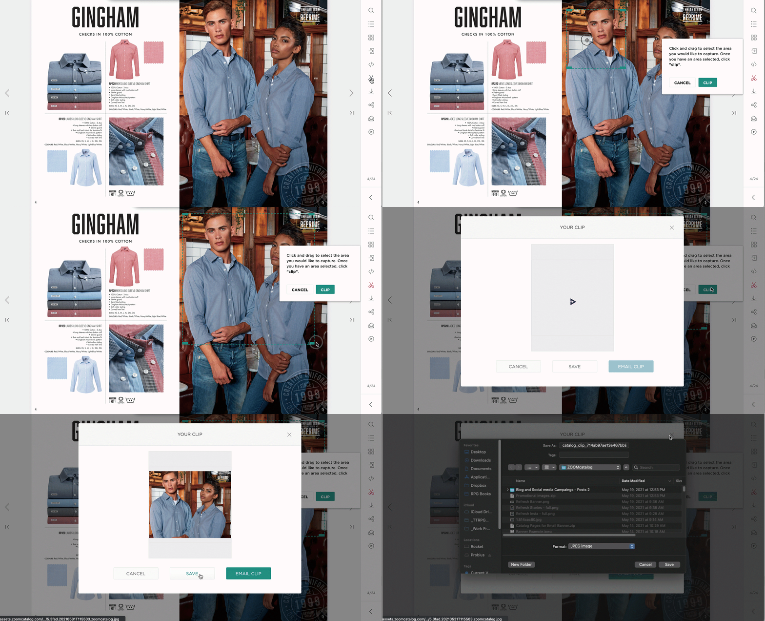
When you find a great image in a ZOOMcatalog, you can easily clip and download it with the clipping tool. (We explain how here.) Then it’s just a matter of firing up your social app and composing your post.

But what about those suppliers who don’t have the resources to do those expensive photo shoots? What do you do then?
Enter our favorite stock photo gallery — Unsplash. This website has thousands (millions maybe?) of royalty-free photos ready for you to use in your social media posts, presentations, email campaigns, and more. Plus, they don’t have that “this is obviously a stock photo” feel. They’re just really cool photos. For free. What could be better?
Well, we’ll tell you: We’ve integrated Unsplash into our ZOOMstudio Smart Layouts app, making it incredibly easy to search for and drop in any photo from the Unsplash repository.
(If you don’t have access to Smart Layouts yet, don’t worry. Distributor access is coming soon, and suppliers just need to message us to find out how they can add the app to their ZOOMcustom membership.)
Want to learn the ins and outs of Unsplash in Smart Layouts? Or maybe you just want to talk shop and get some one-on-one marketing advice? Drop us a line and keep your eyes open for more Trends by ZOOMcatalog.
Effective Email Marketing: What You Need to Know
When it comes to selling your products in an increasingly online world, one of the best things to do as a supplier is create an email…
How to market your ZOOMcatalogs
Marketing your ZOOMcatalogs and ZOOMcustom catalogs and flyers is important! Make sure distributors know about these awesome new tools you…


