Share this post


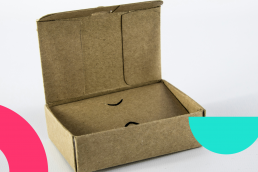
Unboxing Success: The Power of Packaging in the Promotional Products Industry
Branded packaging isn't just about slapping a logo on a box—it's about weaving your brand story into every fold and crease. It's the secret…
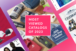
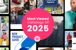
20 Most Viewed Catalogs of 2023
We’ve crunched the numbers from all the corners of the internet – ZOOMcatalog's search engine, buying group tools, distributor and suplier…
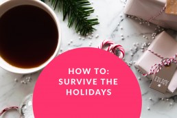
Surviving the Holidays
The end of the year arrives, predictably, at the same time every year. And yet clients consistently find themselves caught off guard!
2023 Holiday Head Start
In the promotional products industry, Summer is the perfect time to gear up for the holiday season. Get ready to sleigh your competition!…
Holiday Marketing with ZOOMcatalog
Help your customers spread joy this holiday season with promotional products. Branded gifts are the perfect way for companies to say thank…
Unboxing Merch Boxes
Unboxing has taken TikTok by storm. These trending videos have turned the app into the perfect place to promote your products and lead to a…
Getting Started with ZOOMstudio: Best Practices for New Users
Whether you're a new user looking to get the most out of your new subscription, or a veteran trying to learn more tips and tricks to…
Five Tools to Level Up Your Website
In the competitive landscape of the promotional products industry, a well-designed supplier website equipped with essential digital tools…
What’s New: An All-New Way to Edit Product Details
Our team has been working hard, paving the way to add virtuals into ZOOMstudio, and how you edit product details in your designs is an…