ONLINE CATALOGS: trends for 2018
More and more people are using online catalogs instead of print catalogs. As a result a, number of unique trends have emerged. This guide outlines several trends to keep in mind when planning and designing your 2018 catalogs.
Fonts
PART ONE: FONTS FOR LITTLE SCREENS
In the past, font size 12 was acceptable in print catalogs. Easy enough for a person to read, but not anymore. Size 12 font in your catalog design can end up very small when the catalog is scaled to a laptop screen, tablet or even a phone. Using larger fonts in your catalog allows viewers to read your content without having to zoom and pan around the page.
PART TWO: LESS IS MORE
You don’t need many fonts when you’re thinking of how to design a catalog – just a heading, subheading and body copy font – so three fonts max. Use these fonts consistently throughout the catalog to keep things cohesive and easy on the eye. While this trend keeps things clean for online catalogs, it is actually an important design tip for print as well.
Products
BIGGER IS BETTER
Most suppliers try reduce the number of pages in print catalogs by featuring multiple products per page. Printing catalogs with hundreds of pages can get expensive, but this is not true with online catalogs! The beauty of online catalogs is you are not constrained by page count and can use bigger product images, bigger text and fewer images per page to enhance your readers’ experience.
Covers
PART ONE: FIRST IMPRESSIONS ARE IMPORTANT
The cover of your catalog is one of the most important elements of your catalog. Not only will a distributor draw conclusions about your company based on the design of your catalog cover, but it might even be the difference between them opening the catalog or moving on. So what makes for a good catalog cover? The answer to this question is different for print catalogs versus online catalogs. When designing a cover for a print catalog, factors such as texture, paper quality and color schemes come into play – these factors can greatly increase the likelihood of someone opening your catalog. With digital, there are limitations that must be considered if you want to design a cover that makes opening the catalog irresistible to the distributor.
PART TWO: WHAT MAKES A GOOD COVER?
- Your cover needs to tell a story. Fun patterns and designs are nice and can be catchy, but incorporating product is important.
- Keep things simple and do not clutter up the cover with too many elements.
- Make sure your logo is large and clear. Someone might be looking at your catalog on their tiny phone screen.
- Pick colors that look good on a monitor. Make sure the colors are RGB and not CMYK. The RGB scheme has a greater range of colors than CMYK and can produce colors that are more vivid and vibrant.
Dimensions
SIZE MATTERS
The dimensions of a publisher’s printed catalog may be influenced by factors such as postal rates, the cost of storing boxes of catalogs at the fulfillment center, printing costs or even the impression the business wishes to make. But in the digital world the only factors that matter are the user experience and the size of the screen. While standard 8.5” x 11” catalogs look fine online, if you are designing a catalog that will not be printed you may want to adjust the page size.
Breakout Catalogs
CATEGORIES AND THEMES
Because of the costs associated with printing, only large suppliers with million dollar marketing budgets were able to create multiple catalogs in addition to their full line catalog. Why did they do it? Because creating smaller, more targeted catalogs can be a very effective way to present your products to end-users. Now more than ever, suppliers are creating smaller themed catalogs (such as school, beach, tech, real estate, etc.) for online use only.For a fraction of the cost of printing suppliers can now create breakout online catalogs for distributors and we highly recommend you do too. Help distributors market your products more effectively!
Distribution
MULTI-CHANNEL DISTRIBUTION
Print catalogs are not only expensive to print and ship, it is also nearly impossible to tracktheir ROI. How many catalogsyoumail out are actually being opened? We guess atLEASThalf end up inthe trash.
Another benefit of online catalogs is you can actually track how your catalogs are performing. When online catalogs were first introduced suppliers would link theirs to their website and be done. While it is a nice feature to have on your website, there are so many other ways to distribute your catalog online. This is ZOOMcatalog’s expertise – multi-channel distribution. With ZOOMcatalog your catalog is not only available on your website, but also thousands of distributor websites, the ZOOMcatalog mobile app, the ZOOMcatalog Facebook app, the ZOOMcatalog search engine and more. You can even access live stats about your catalog performance at any time.
Smaller businessesmay nothave theresources fora complete redesign for the digital version of their catalog. Do not be discouraged! Adoption of even a few design changes when transitioning a print catalog to a digital catalog will make a substantial difference in distributors’ viewing experience and, thus, their overall engagement with your catalogs.
Happy designing.
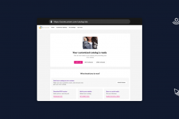
ZOOMcustom has a new and improved catalog share page
Last month we released a big update to one of the most used parts of ZOOMcustom - the share page. Learn about the new page and what it…
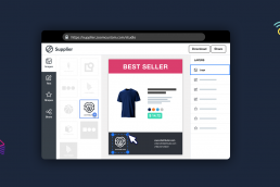
Feature Releases: Reusable templates in ZOOMstudio and more
ZOOMstudio templates are here! You, the Suppliers, can now set up reusable templates for your sales team and distributors.
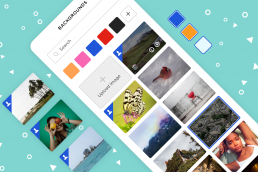
New in ZOOMstudio, Better Backgrounds!
Today we’re introducing a feature that will make creating beautiful flyers, social images, presentations, and other marketing materials…
Feature Releases: June 2019
Layer locking, improved image handling, product labelling, and fully editable pricing tables are just some of the great improvements our…
- 1
- 2


