Share this post


Case Study: Rethinking ZOOMcatalogs with The Magnet Group
Recently, The Magnet Group's Webmaster, Nathan Baine, approached our team with an exciting request: he wanted a way for users to…

3 Key Insights from HPG’s Digital Journey
We sat down with HPG’s marketing director, Ben Pawsey for a deep dive into their digital strategies, and we’re here to break down three key…
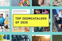
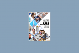
Top ZOOMcatalogs of 2020
Here are the 25 most viewed ZOOMcatalogs of last year. There are a number of factors that go into attracting views to a ZOOMcatalog...

Beyond the Full-Line Catalog
In recent years, major brands have discontinued their massive print catalogs that were historically valued for their “thud effect” in favor…
How To Steal Amazon’s Print Catalog Strategy
What do you do when the largest eCommerce company in the world starts to step on the toes of your promotional products business? The answer…
Digital vs Print Catalog Design: 7 Things to Consider
Catalogs are a key piece of any promotional product supplier’s marketing arsenal, but the way they’re designed and deployed is evolving.…
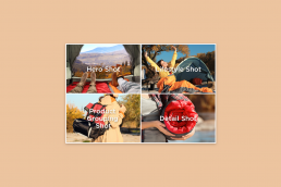
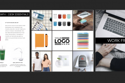
4 Product Photos That Will Make Your Next Catalog Sell More
A great photo can tell an entire story. Sometimes these photos even have the ability to stop people in their tracks and completely steal…
Case Study: Digital Distribution of a PPE Catalog
High Caliber Line launched a new ZOOMcatalog, filled with PPE products. Upon launch, hundreds of distributors customized it as their own…

Industry Spotlight: The Promotional Products Industry before, during, and—eventually after—the Coronavirus.
The last few months have been quite different. We’ve all been inside, trying to maintain normalcy and routine, while we continue to push…

What you can learn from the 370% increase in demand for puzzles
When was the last time you conquered a 1,000 piece puzzle? To some, that's a measly warmup. For others, it's a feat worthy of a wall…
A Catalog for the Community – by Jamie Fritz
Jamie Fritz, a designer and former Promotional Product distributor, put together a catalog and was offering it to distributors that were…
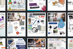
COVID-19: Flyer Collections and Kit Ideas
Here are some popular product collections, themes and kits that distributors are looking for on ZOOMcatalog right now.