Breakout Spotlight: SanMar’s Sustainable Styles
Sustainable fashion isn’t solely reserved for trendy tees. Inside this catalog, you’ll find everything from hoodies to fleeces, caps, and…
Get a Holiday Head Start
Timing is everything, especially when it comes to the holidays. This year, though, shipping delays can throw more than one wrench into the…
Marketing Tip: Create The Perfect Holiday Social Media Post
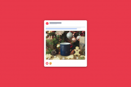
In the Promotional Products world, September is the month to start your holiday marketing to ensure your customers have time to find and…
Breakout Spotlight: S&S Back to School Style Guide
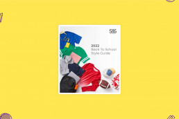
In our trends email, we talked about back to school, and the fall is coming sooner than you think. Summer camps, campus tours, and soon we…
3 Simple Ways to Distribute Your ZOOMcatalog at a Show
These quick tips will show you how to get your ZOOMcatalogs into the hands of your distributors.
Untangle Your Multiline Communications
Multiline reps are entrepreneurs who own their own businesses. That means they need to develop their own branding and messaging while…
September and October 2022 Marketing Planner
Days are becoming shorter, the weather is turning and a new season is coming. Fall brings more than just Pumpkin Spice Lattes (although, we…
Fight Night: Websites VS Lookbooks
When it comes to marketing and sales, you’ve got a lot of tools in your toolbox. However, when it comes to all things digital, many…
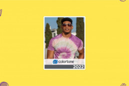
Breakout Spotlight: Colortone
As popular as DIY is, it doesn’t always make sense to make your own. That is where Colortone came in with a whole line of options from tank…
Tech Terms: Do You Speak Tech?
Our marketing team has a diverse promo background. We’ve worked with suppliers and distributors alike, but no one would ever accuse us of…
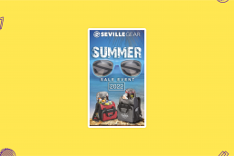
Breakout Spotlight: Seville Gear
Summer is always sweeter with a sweet deal and Seville Gear is bringing out the savings with this Summer Sales Event catalog. From coolers…
Breakout Spotlight: Maple Ridge Farms’ Experience This!
Each week, the breakout spotlight features a seasonal, breakout, or niche catalog on ZOOMcatalog. We'll tell you why we love it, give you…


